Data description
We create the variable trans with some minor modification in order to set easier to remember column names, and set the Donation as a factor.
So the labels are:
- Recency: months since last donation
- Frequency: total number of donation
- Monetary: total blood donated in c.c.
- TFirst: months since first donation
- Donation: If the donor return in march
Descriptive Stats
First a summary of the data is calculated. Is possible to realize that the average of time since the last donation is 9 months. And have a mean of 5 donations. They give a liter of blood. And its been a mean of 2 year and 9 months since the firs donation.nd just 178 subjects return in march.
summary(trans)
##     Recency         Frequency         Monetary         TFirst           Donation
##  Min.   : 0.000   Min.   : 1.000   Min.   :  250   Min.   : 2.00   NonDonate:570
##  1st Qu.: 2.750   1st Qu.: 2.000   1st Qu.:  500   1st Qu.:16.00   Donate   :178
##  Median : 7.000   Median : 4.000   Median : 1000   Median :28.00
##  Mean   : 9.507   Mean   : 5.515   Mean   : 1379   Mean   :34.28
##  3rd Qu.:14.000   3rd Qu.: 7.000   3rd Qu.: 1750   3rd Qu.:50.00
##  Max.   :74.000   Max.   :50.000   Max.   :12500   Max.   :98.00
Boxplots
boxplot(trans)
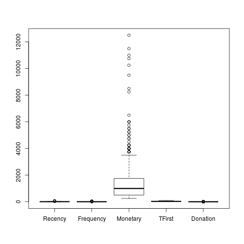
Because the Donation is a factor of the dependent variable, the creation of their boxplot can be avoided. And the M boxplot is out of range from the rest so we can create a extra boxplot.
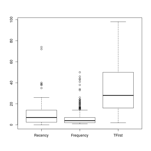
boxplot(trans[c(-3,-5)])
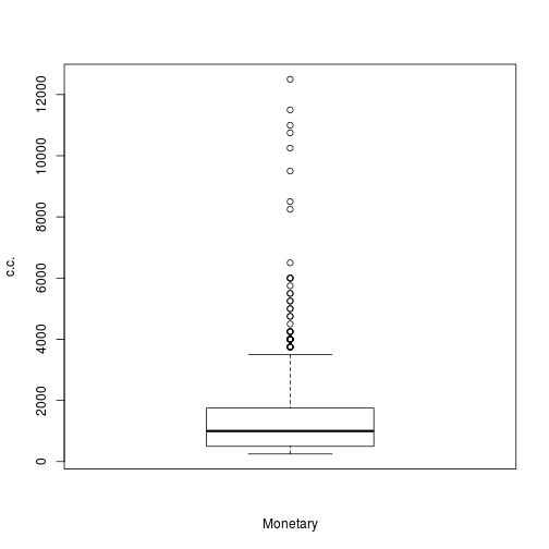
boxplot(trans$Monetary, xlab = c("Monetary"), ylab = "c.c.")
Histograms
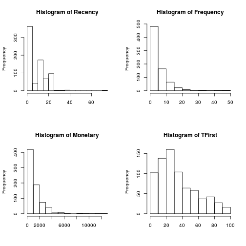
Standard count histograms were created in order to look at the distribution of the measurements, Recency, Frequency, Monetary and First Time Donation. For Donation and with two values, is not necessary an histogram.
par(mfrow = c(2, 2))
for (i in 1:length(trans[1:4])) {
    hist(trans[, i], main = paste("Histogram of", names(trans)[i]), xlab = NA)
}
Density plot
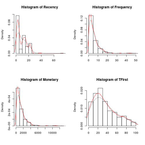
Then the Probability histograms, which shows the probability of distribution for each variable are overlapped whit two Density plots, in red the density plot for the accumulation of values, and the dotted line shows the adjusted density plot.
par(mfrow = c(2, 2))
for (i in 1:length(trans[1:4])) {
    hist(trans[, i], main = paste("Histogram of", names(trans)[i]), xlab = NA, prob = T)
    lines(density(trans[, i]), col = "red")
    lines(density(trans[, i], adjust = 2), lty = "dotted")
}
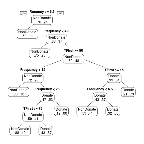
Classification Tree
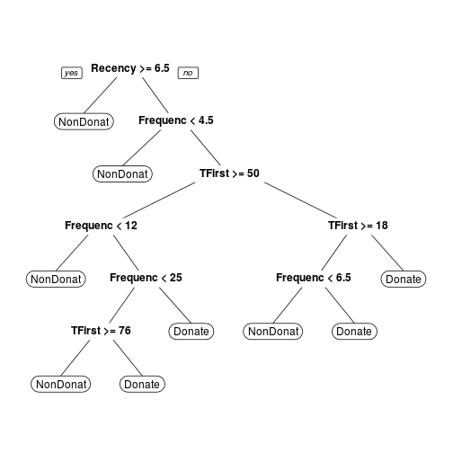
First a Classification Tree with a formula which combine Dependent Variables in function of Independent Variables.
Note: From this tree is possible to acquire the complexity values(CP) which are going to be used in the Prune function.
transtree <- rpart(Donation ~ Recency + Frequency + Monetary + TFirst, method = "class", data = trans)
prp(transtree)
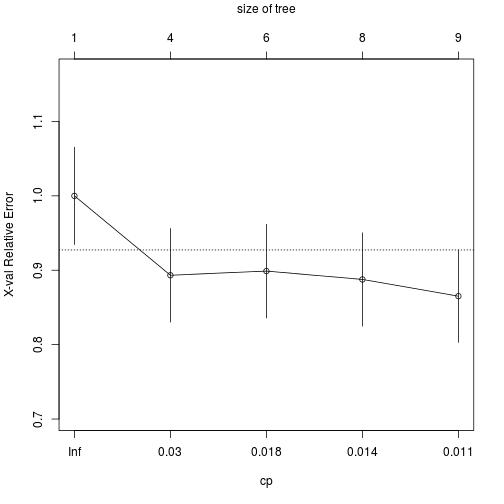
printcp(transtree)
##
## Classification tree:
## rpart(formula = Donation ~ Recency + Frequency + Monetary + TFirst,
##     data = trans, method = "class")
##
## Variables actually used in tree construction:
## [1] Frequency Recency   TFirst
##
## Root node error: 178/748 = 0.23797
##
## n= 748
##
##         CP nsplit rel error  xerror     xstd
## 1 0.046816      0   1.00000 1.00000 0.065430
## 2 0.019663      3   0.85955 0.89326 0.062862
## 3 0.016854      5   0.82022 0.89888 0.063005
## 4 0.011236      7   0.78652 0.88764 0.062717
## 5 0.010000      8   0.77528 0.86517 0.062127
plotcp(transtree)
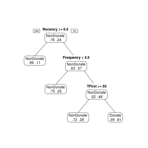
Pruning
With the CP we can prune the tree in order to get the optimal number of nodes with the minor Relative Error.
transtree.pruned <- prune(transtree, cp = 0.011)
prp(transtree.pruned, type = 1, extra = 4, varlen = 0)
Another option is to use the smallest tree whose cross-validation error is within one standard error of the smaller. In this case could be cp = 0.03, easy to see in the plotcp.
transtree.pruned <- prune(transtree, cp = 0.03)
prp(transtree.pruned, type = 1, extra = 4, varlen = 0)
Random Forest
The Random Forest approach use a series of random generate Trees in order to get the variables which better explain the dependent data.
set.seed(778688)

transforest <- randomForest(Donation ~ Recency + Frequency + Monetary + TFirst, data = trans,
    importance = T)

transforest
##
## Call:
##  randomForest(formula = Donation ~ Recency + Frequency + Monetary +      TFirst, data = trans, importance = T)
##                Type of random forest: classification
##                      Number of trees: 500
## No. of variables tried at each split: 2
##
##         OOB estimate of  error rate: 24.73%
## Confusion matrix:
##           NonDonate Donate class.error
## NonDonate       510     60   0.1052632
## Donate          125     53   0.7022472
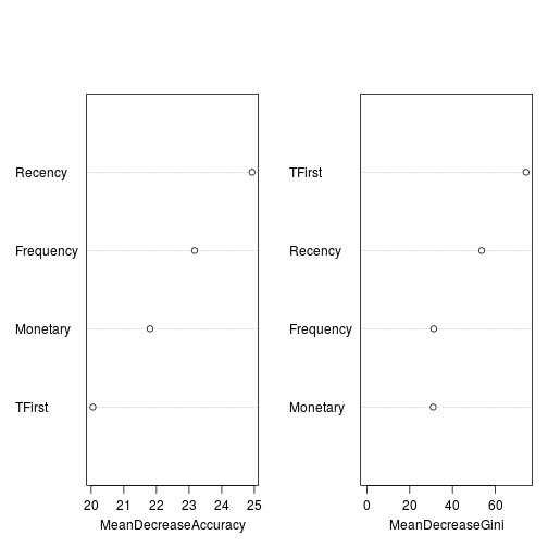
Importance table represents how much removing each variable reduces the accuracy of the model. And the Right (MeanDecreaseGini) shows how each variable reduces impurity at all tree nodes.
importance(transforest)
##           NonDonate    Donate MeanDecreaseAccuracy MeanDecreaseGini
## Recency    10.24412 32.022719             24.92773         53.62862
## Frequency  18.35183  7.706997             23.16787         31.22092
## Monetary   17.67934  6.341006             21.80268         30.97825
## TFirst     18.23311  2.851695             20.05375         74.34059
varImpPlot(transforest, main = NA)
Review of Questions
Actually when the correlation is reviwed between Monetary and Frequency, the correlations is 1.
cor.test(trans$Monetary, trans$Frequency)
##
##  Pearson's product-moment correlation
##
## data:  trans$Monetary and trans$Frequency
## t = 1296100000, df = 746, p-value < 2.2e-16
## alternative hypothesis: true correlation is not equal to 0
## 95 percent confidence interval:
##  1 1
## sample estimates:
## cor
##   1
And there is a high correlation between Monetary and Frecuency with the time from the first donation variable (TFirst)
cor(trans[-5])
##              Recency  Frequency   Monetary    TFirst
## Recency    1.0000000 -0.1827455 -0.1827455 0.1606181
## Frequency -0.1827455  1.0000000  1.0000000 0.6349403
## Monetary  -0.1827455  1.0000000  1.0000000 0.6349403
## TFirst     0.1606181  0.6349403  0.6349403 1.0000000
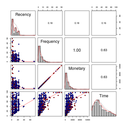
It is important to notice that the correlation is not only between these two variables, but also the tendecy of Time with the same two(Frequency and Monetary). Youn can see the donators(red), non donator(red).
x <- pairs(dat[-5], cex = 1,pch=21, bg=c("blue","red")[dat$Donates],
      lower.panel = panel.smooth, diag.panel = panel.hist, upper.panel = panel.cor)
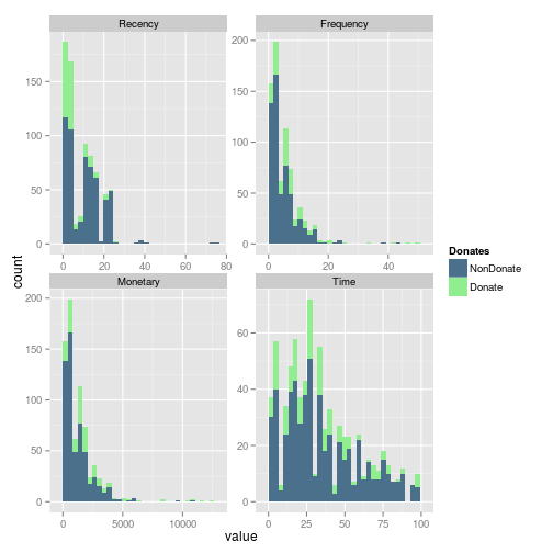
Wen we include in the histograms the information of donation, we can easily see that in the Frequecy, the most of the frequent donators, donates. And looks like an important number of donators come recently donates.
gg <- ggplot(m.dat,aes(x=value, fill=Donates)) +
  geom_histogram() +
  scale_fill_manual(values=c("NonDonate"="skyblue4","Donate"="lightgreen")) +
  facet_wrap(~variable, scales ="free")
print(gg)
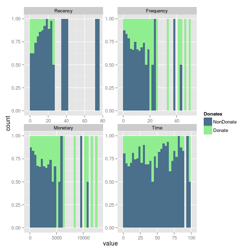
In fact whe we review the fill representation of each condition, the Frequency looks like a good variable to explore. Mainly beacause of the subjects which more frequently donates return to donates.
gg<- ggplot(m.dat,aes(x=value, fill=Donates)) +
  geom_histogram(position="fill") +
  scale_fill_manual(values=c("NonDonate"="skyblue4","Donate"="lightgreen")) +
  facet_wrap(~variable, scales ="free")
  print(gg)